Passion for design comes from a deep understanding of how things work and from looking for constant efficiency.
When approaching design, many people’s initial instinct is to focus on beauty. They create beautiful things and develop amazing ideas, but those ideas don’t seem to work. Alternatively, other people’s instinct is to focus on functionality. They create things that could be useful, except nobody wants to use them. When it comes to web design, and this is particularly true in the healthcare community, you have people who either focus on beautiful sites that offer poor content or who focus on functional sites that offer an overwhelming amount of information. It’s no secret that overcrowded websites have the lowest rates of reading. It’s not a matter of quantity of information, but rather the distribution of information, that is important.
At Boider, we try to balance both approaches. We understand it’s important for you to say whatever you want to say. For that reason we believe that beauty and functionality can’t be separated. People are naturally drawn to attractive things but only stay and want to share if there is something useful for them.
Typography
Since their invention, printed materials were used to communicate ideas. Typefaces are the physical appearance of the written word. They can transmit a mood or emphasize or diminish an idea by themselves. For that reason, all our designs are carefully crafted while paying close attention to typefaces. We consider which to use, how to combine different typefaces, how many typefaces to combine in one design, etc.
Color management
We are obsessed with colors and different color combinations. Colors can affect people’s perception of ideas presented. For that reason the thoughtful use of colors is essential in the creation of effective visual communication. Below are examples of real designs we have created. We believe they will give you a good idea of our thought process and approach to design.
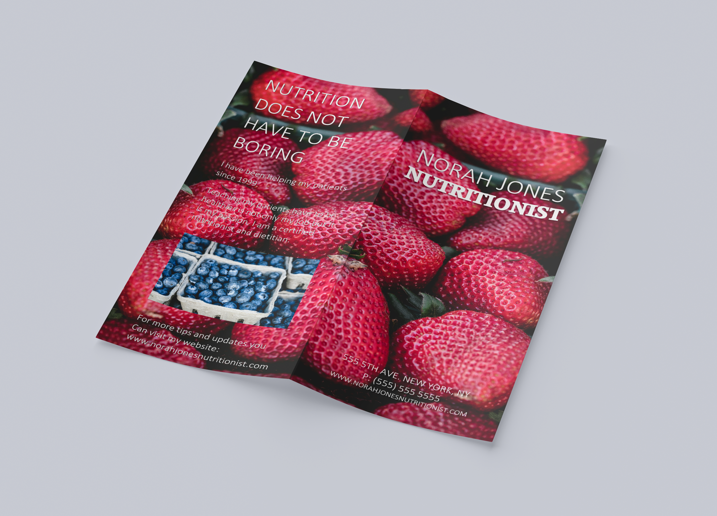
Norah Jones. Nutritionist. Flyer.
Brand: Norah Jones, Nutritionist
Design: Attracting customers through printed marketing has become harder and harder. For that reason, we chose a strong image and strong colors (the contrast between the red strawberries with the dark blueberries) to grab people’s attention.
Typography: For this design we used Calibri (a thin sans-serif) for the client’s name and Accord Heavy (a thick serif) for the word “Nutrition” Our intention was to highlight the word “Nutrition.” Also, the bright white we used is a nice contrast with the intense red of the background.
Sports Medicine. App.
Brand: Sports Medicine
Design: In this case, the client owns a sports medicine center and he wants to showcase a new app his center has developed. As the app focuses on exercises to prevent injuries, we chose a positive image (a runner) rather than using an image that shows patients or treatments.
Typography: We used Baskerville Old Face to highlight the word “Sports” and Candara as a san serif for the word “Medicine.” We wanted the image to be the main focus of attention.
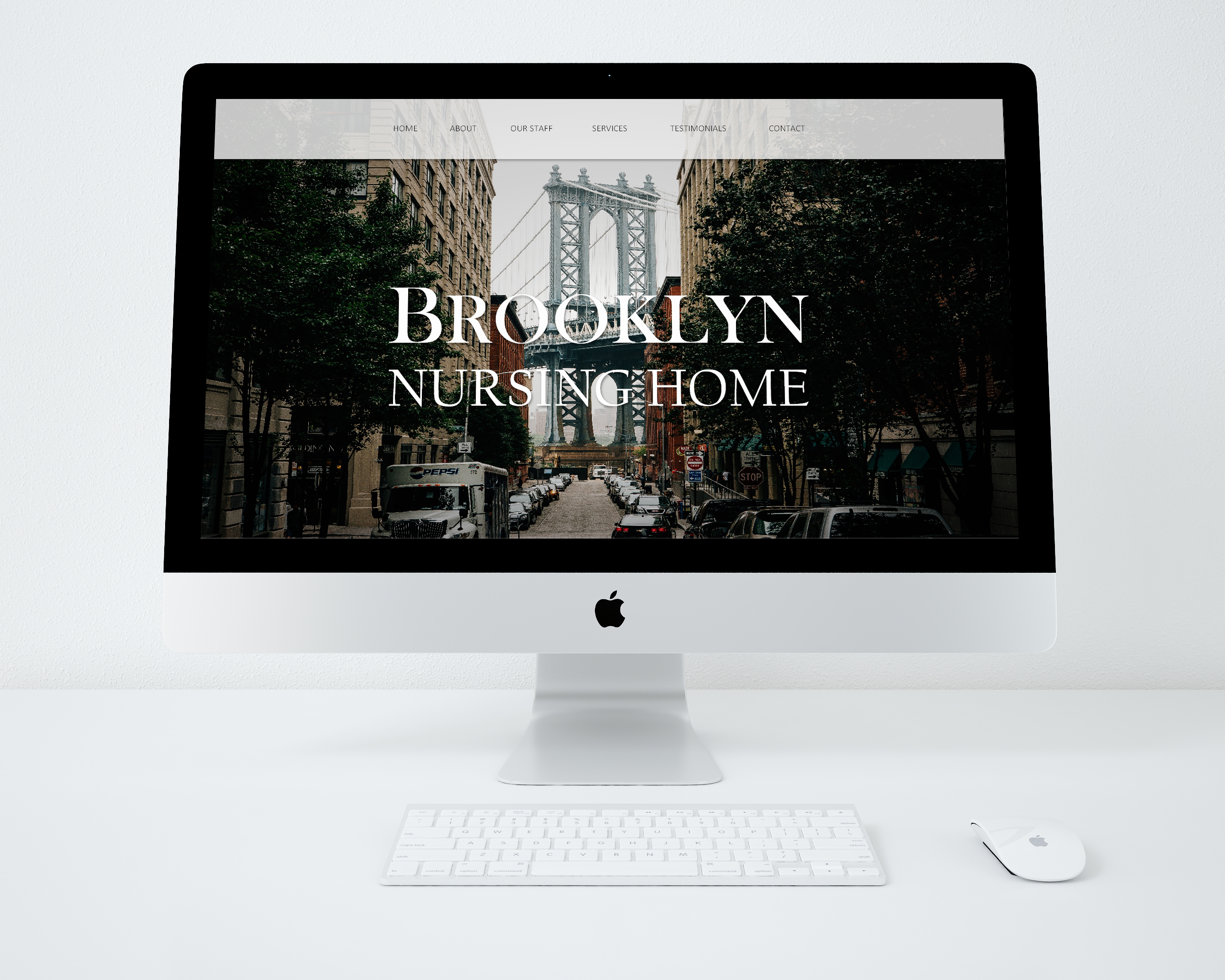
Brooklyn Nursing Home. Website.
Brand: Brooklyn Nursing Home
Design: In this example we try to emphasize the location and convenience of the client’s facility. We achieve this primarily by showing a visual and presenting a simple and clean brand image.
Typography: Since the client wants to showcase the location, we used Baskerville Old Face with a greater difference between thick and thin strokes. We also capitalized the letter “B” to draw attention to the word “Brooklyn.” For “Nursing Home” we used California FB, a thinner serif, to balance the design without creating a contrast between both fonts that could distract people’s attention to the words, rather than the image.
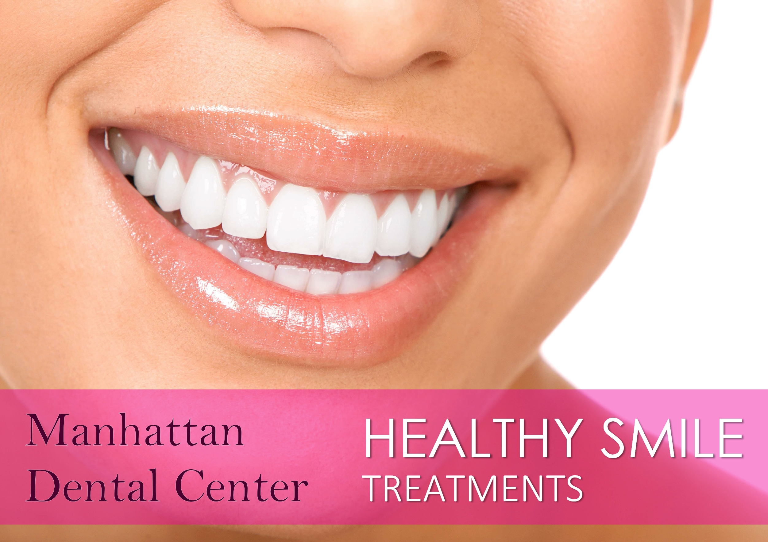
Manhattan Dental Center. Brochure.
Brand: Manhattan Dental Center
Design: In this case, our client (an orthodontist clinic) wants to highlight their hygienist services. For that reason we created a program called Healthy Smiles. We used a clean image and moved the text to the bottom to not distract people’s attention from the image.
Typography: Calibri, Century Gothic, and Bell MT. In this case we used 3 typefaces. First, we wanted to make a distinction between the brand and the programs. That’s why we used Bell MT for the Brand, a nice serif with a high contrast between thick and thin strokes. For the words “healthy smile” we used Century Gothic (a rounded sans-serif) and we used Calibri (a straight line sans-serif) for the word “treatments”.
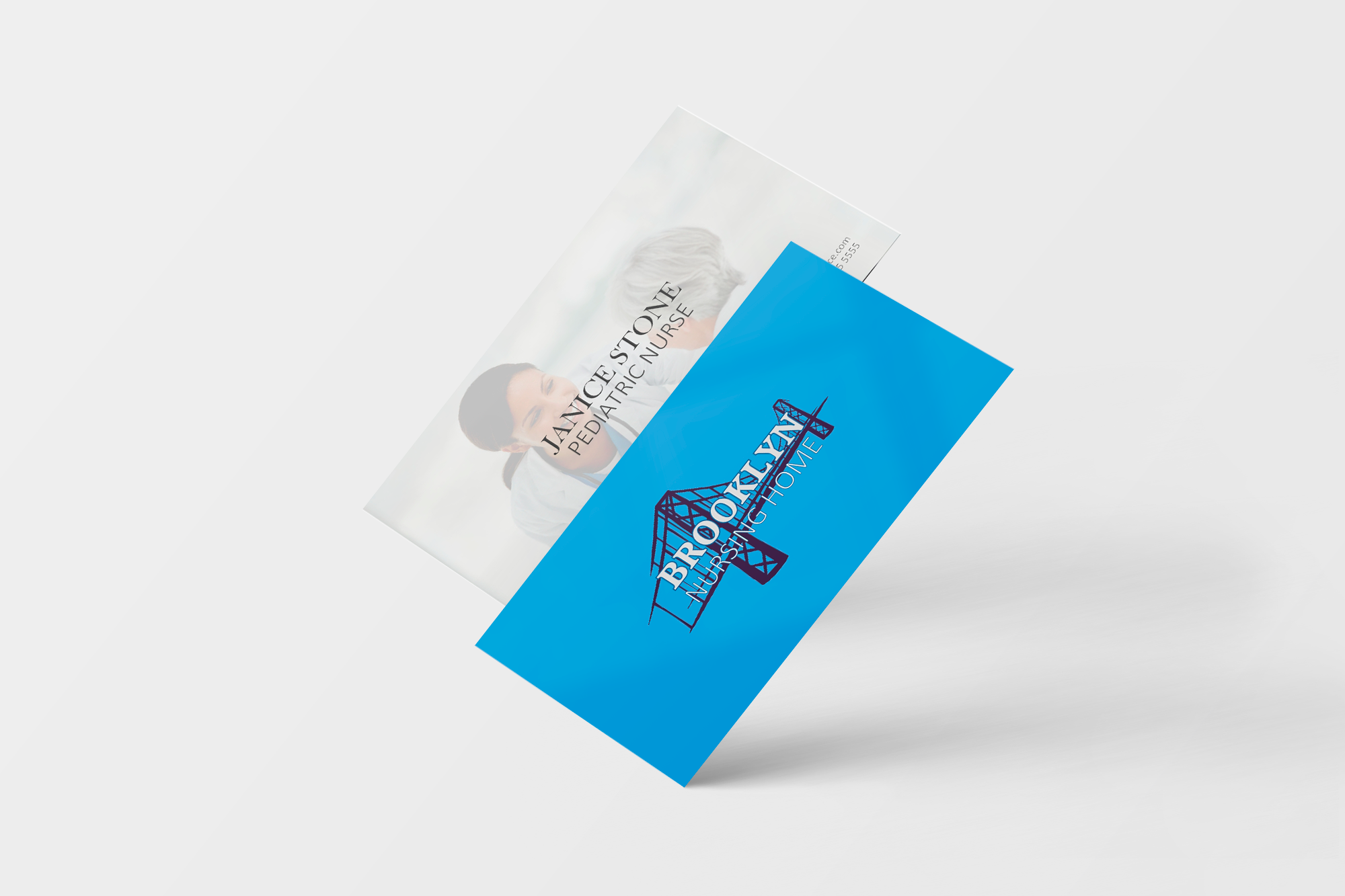
Nursing Home. Business Cards.
Brand: Brooklyn Nursing Home
Design: With this client we tried a different and more personalized approach. On the back we have the logo, created with the Brooklyn Bridge and two different typefaces: a thick serif for the name and a thin sans-serif for the nursing home element. We used a transparent picture as the background of the front side.
Typography: Accord Heavy SF, Calibri light. For this design we chose Accord Heavy SF (a thick serif) with a thin border, to highlight the word Brooklyn, and Calibri Light for the words “Nursing Home.”